Monday, March 22, 2010

ICC Profiles

Generally speaking, an ICC profile is a set of data that characterizes a color input or output device, or a color space. ICC profiles can be created for certain monitors, printers, papers etc.

Before you get a print made, it's a good idea to download the ICC profile for the paper you are using so that the colors come out right. Epson has a series of profiles for the different papers they use, as do different labs. (There are different profiles for different printers. For example, here are the profiles for the Epson 2200.)

Adorama has a series of ICC profiles you can download for the different papers they offer.

Here's how to do it:

Download the profiles here http://www.adoramapix.com/Support.aspx?SupportID=prepcolor

If you're on your home computer (MAC), click on the hard drive and find the folder that says "Library". Open that, look for the "Color Sync" folder, Then look for the folder called "Profiles". Drop the ICC Profiles you've downloaded in that profiles folder. (If you're on a school computer where you don't have admin proveldges, drop the files into /Users//Library/ColorSync/Profiles — any profiles stored here are available only to the current user.) For PC user instructions, click the link above.

Then in Photoshop, you can launch the profiles by going to view > proof setup > custom, and choose the Adorama profiles. Leave the box as is (with the default settings) The box should look like this:


Once you do the proof setup then go to Edit > convert to profile. Choose the Adorama profile for whatever paper you're printing with and save the file.

At Adorama, if you've used a profile and made your own color corrections, you should NOT check the box to have Adorama correct the colors.

If you don't have time to download the ICC profile, saving as sRGB is the next best when printing at Adorama (it's different for each lab so call and ask if they have profiles you can download or if you should save your document as Adobe RGB or sRGB. Print Space requests that you save as Adobe RGB).

Tuesday, March 16, 2010

Midterm Due April 5

One large print (11x14 or bigger) from the Projection Shoot is due April 5th.
*** PLEASE also turn in your files digitally (as RAW, TIFF or JPG)

Lab Suggestions: **I strongly suggest that you take your images to the lab and view the photo on their calibrated monitor before sending it off to print. This will assure that the colors look how you want them to!***

The Print FX Graphics Lab at FIT, D 5th Floor

Printspace
Costs a little more, but more professional and will work with you personally if color is off. You email them an image and pick it up within 24 hours. They do inkjet and digital c-prints.
Adorama
Cheaper, but not as professional. Slightly lower quality prints, but still reasonalbly good. Only digital c-prints. More paper choices than Adorama. Pay rush fee for 24 hour service, otherwise takes a few days.

Checklist for before you take your images to the print lab:

-shot in RAW, saved as a tiff (Give the lab a TIFF or hi-res JPG)
-make a duplicate image, flatten, sharpen
-Process in the RAW window at 300ppi
-Make sure your document size matches the output (paper) size. i.e....if you're making an 8x10 print, size your document to 8x10.
-Make sure your image is in the right color space. Color space should be Adobe RGB 1998 or sRGB (depending on what your lab requires- call to ask. Adorama needs sRGB, Printspace needs Adobe RGB 1998) In the camera RAW window, choose the correct color space. Or later, once you've opened the document in Photoshop, see what mode you're editing in on your monitor. Go to VIEW > PROOF SETUP > CUSTOM and choose Adobe RGB 1998 or sRGB, whichever your lab requires. To see what color space your document is, in Photoshop go to EDIT > Color Settings. Again, choose Adobe RGB 1998 or sRGB. Then go to EDIT > Convert to Profile and see if what setting your document is (Adobe RGB 1998 or sRGB). Change it if need be.


Adorama
makes digital C-Prints and has reasonable prices. They have a wide selection of papers and you can upload your images online.
http://www.adoramapix.com/PriceList.aspx
Adorama Camera, Inc. 42 West 18th Street New York, NY 10011. 888.216.6400
Print Space is a small and very friendly lab on 19th Street. You email your highest res JPG to them at psdigital@gmail.com, tell them your paper preference and size and they call you the next day to let you know when it's ready.

In-Class "Projection" Shoot March 22

In-class on March 22, we will be doing a shoot, so please plan accordingly. Images you have shot digitally and as slide film will be projected onto the subjects of your choice. Please bring PROPS! As you are shooting your slides to project, continue to focus on texture. Your Midterm (due April 5) will be an 11x14 or larger print of the best image from this shoot. Here are some ideas:


photos by erin gleeson

Photographing Texture While Looking at Daylight Color Temperature


Above image by Aaron Siskind

In thinking compositionally about the work of Aaron Siskind, the class set out on a walking/shooting field trip around the Meatpacking District. Working in partners, one student shot film and the other digital. In looking at the color temperature between sun and shade, CC filters (CC05R, CC10R and Skylight) were used over the lens to correct color temperature. The following week, contact sheets were compared to look at digital vs. film.

By Bridget, Victor & Paul:


By Craig & Jessica:


Sunday, March 14, 2010

Color Film vs. Digital: Class March 15


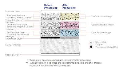
Pictured above: Basic Color Film Structure

How is color recorded differently on Film vs. Digital\?

Negative vs. Transparency:
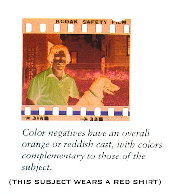
Negatives show reverse (complimentary) tones of the original subject and have an overall reddish-orange cast. This orange cast helps to control color balance and contrast in printing.

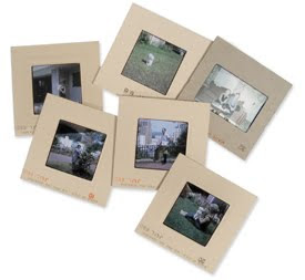
Transparency (Chrome) Film is used more professionally. It shows a positive image of the subject and can be easily viewed on a light table. The film itself is more expensive, however you don't need to make a contact sheet.
There is generally more flexibility in push and pull processing when shooting a negative that when shooting a slide.

Push Film Processing: (brightens the film) over-development of the film, compensating for under-exposure in the camera.
Pull Film Processing: (darkens the film) a technique that compensates for overexposed film by under- developing it at the processing stage
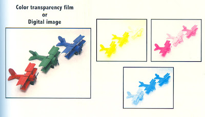
This difference could be compared in digital photography to shooting a JPG (chrome) vs. RAW (negative). Negatives (like raw images) have more exposure latitude and better correctability when printed. Chromes or Jpgs aren't so forgiving or flexible.

Professional vs. Amateur Films:
Professional films are manufactured according to specific color specifications so that one can control color. An amateur version of a certain film may have more saturation or higher contrast for added impact, whereas a the pro version of that film may have less intensity and contrast to allow for more accurate skin tones or greater detail. This difference could be compared in digital photography to shooting a JPG (amateur) vs. RAW (pro). A JPG has automatic settings applied whereas in a RAW file, the photographer is able to manipulate the color and contrast greatly.

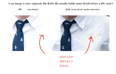
JPG vs. RAW:
If exposure is reduced on an overexposed raw image (instead of a JPG), much more detail can be salvaged.

Emulsion Batches vs. Color ICC Printing Profiles:

ICC profles are explained HERE.
For a list of Adorama's Downloadable ICC profiles to match their paper types, click here.

When using film, emulsion batches are used in processing to help get the colors exactly how you want them. Each batch is subject to minor variations in color balance, contrast, etc. Each batch has its own number printed on the film. When shooting film, buy several of the same batch, shoot a test roll & process it. Add filters as necessary to get the colors exactly how you want them. Be sure to print always at the same lab to get the results you want.
Similarly, in digital photography, you can use specific printing profiles. Assigning a specific profile to a TIFF can change the colors in the print. The paper also plays a roll in the way the colors will look. Always working from the same monitor and with the same lab, make a series of prints with different ICC profiles until you get a print with color that matches your monitor exactly.

Daylight Film vs. Tungsten Film:

Similar to the settings in our digital cameras, film is based on Kelvins. Most color films are daylight balanced (5500K) which is average color temperature in direct sun at noon. If you are shooting with this film on a foggy day you may want to use a filter to get the colors correct. Color daylight film will also work indoors when using electronic flash because the output of the flash is about the same temperature as sun (about 5500K). Tungsten film is set to 3200K and is made for indoor lighting (and no flash). If shooting indoors with florescent lighting, it may be necessary to use a corrective gel or filter on your lens to get the color temperature right, as different bulbs have different color temperatures. (Other types of tungsten film are available to buy as well but are not as common). Negatives can be filtered when printed to correct color but with transparency film it is not as easy.

Film Characteristics: Different color films record color differently. Some make colors more vibrant, others make the same colors more muted. The same red balloon shot with one type of color film may look like a different shade of red when shot with another type of film. In digital photography, these colors can be quite easily manipulated and corrected using Photoshop.

Correction Filters (used to correct color temp when shooting film)

Filters can be used on the lens or light source when shooting FILM to adjust the color temperature and make to colors come out correct. Remember that you also need to adjust your exposure to compensate for filters used. Here is a chart of filters and when to use them:
CC filters and 80 series filters that are commonly used.


To more precisely figure out filter factors, first read this chart.

Then use this filter factor converter:
http://www.fineart-photography.com/ff_fs.html

Student Work of the Week: Times of Day Assignment

For the "Times of Day" assignment, students were asked to shoot digitally on the daylight (sun) white balance setting, shooting every couple hours from morning to night, using only natural light (natural light = outdoors). What became evident was the shift in color temperature: cool blue casts seen in the early morning and evening, and warmer tones mid day and at sunset. When shooting with film one must compensate for a color temperature shift using filters. When shooting digitally this can be done in camera by choosing the correct Kelvin temperature in your white balance settings.

Craig's Contact sheet shows the times in which he shot each frame, and a color shift is visible. Early morning is quite blue, midday is much warmer (click image to enlarge):


Notice the drastic color temperature shift in these images taken by Alex Lubrano (left image taken at 6:45pm, Right image taken at 4:45pm):


Both Loreal and Jessica did a beautiful job of adding a narrative to this assignment by creating a story with their series of images taken throughout the day.

Jessica's Series:


Loreal's Series:


This image by Michelle Murray quite beautifully demonstrates the color temperature difference of early morning (6:30am) light and tungsten (lamp) light.

Student Work of the Week: Achromatic Images

An ACHROMATIC color is a color lacking hue, for example BLACK, WHITE or GRAY. In class, students shot achromatic still lifes (digitally and in color) using various continuous lights with different color temperatures. Special attention was given to white balance to make sure the whites looked white and that there was no color cast. Because the images were relatively achromatic, a color temperature was more visibly evident. Kelvin temperatures were noted. For HW, students printed their best image 8x10 and in critique we talked about the challenges of trying to get our print to match the monitor.

Nicole DelMonico:

Liz Gurney:


Jessica Lemos:


Craig Abare:


Paul Kingston: